Similar to the concept of vectors in the design world.
An em is a relative unit of measurement. It is better than using pixels (px), because it adapts based on the screen’s size.
Similar to the way that you can create a vector graphic and scale it up or down to whatever size you need, without losing quality or crispness.
Example use: font-size: 1.2em;
Also known as leading in the design world.
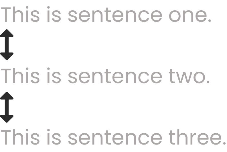
Example use: line-height: 3.2em;
Also known as tracking in the design world.

Example use: letter-spacing: 2.5em;
The space within an element.

Example use: padding: 8%; which is also the same thing as using: padding-bottom: 8%; padding-left: 8%; padding-right: 8%; padding-top: 8%;
The space around an element.
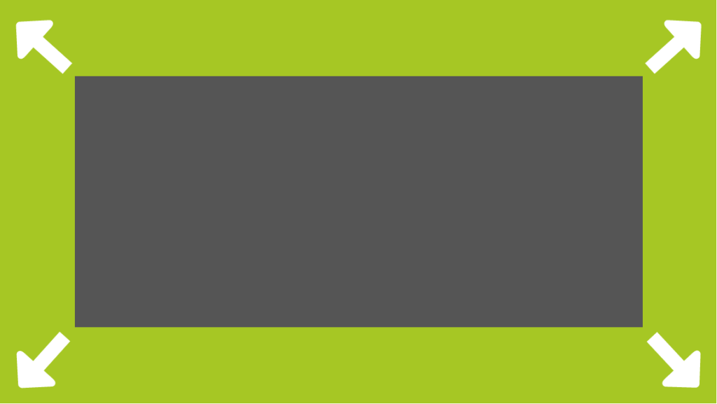
Example use: margin: 5%; which is also the same thing as using: margin-bottom: 5%; margin-left: 5%; margin-right: 5%; margin-top: 5%;


1 comment
It’s not my first time to go to see this website, i
am browsing this site dailly and take nice data from here every day.