Designing a website can seem a bit daunting, but it’s not so bad if you break it into lil bite-sized design chunks!
![](https://fromzerotolaunch.com/wp-content/uploads/2021/09/Group-2873@2x-1024x631.png)
1. A robust color palette.
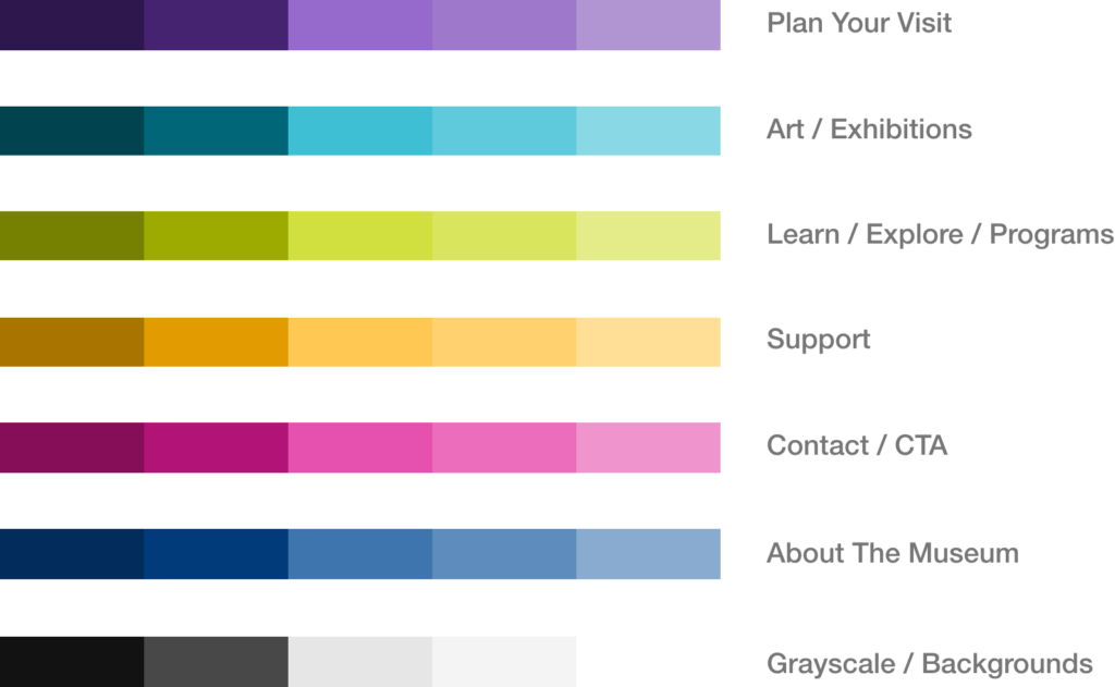
Try using a minimum of three colors, with two tints and two shades for each color.
![](https://fromzerotolaunch.com/wp-content/uploads/2021/09/Group-2874@2x-1024x848.png)
2. A strong type hierarchy.
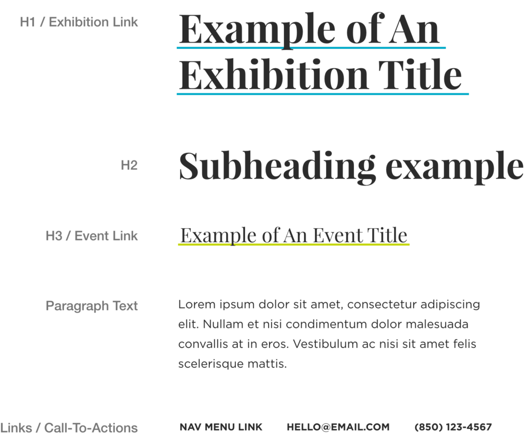
Limit yourself to 2-3 different typefaces.
![](https://fromzerotolaunch.com/wp-content/uploads/2021/09/Group-2875@2x-1024x535.png)
3. A cohesive icon set.
Ensuring all icons have the same style. In this case: outlined, rounded edges, and the same stroke weight.
![](https://fromzerotolaunch.com/wp-content/uploads/2021/09/Group-2876@2x-1024x424.png)
4. Complementary button styles.
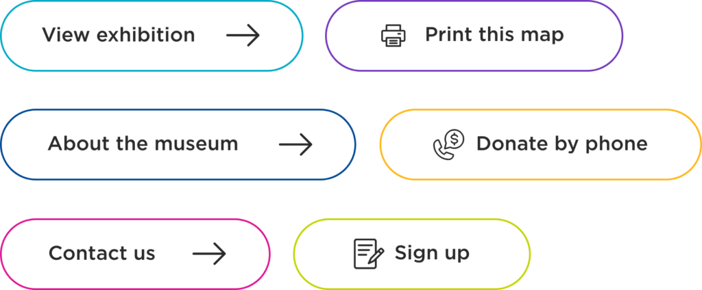
Now, combine your color palette, typography, and icons to create buttons that match!
Putting them all together:
![](https://fromzerotolaunch.com/wp-content/uploads/2021/09/Screen-Shot-2021-09-01-at-4.25.13-PM-920x1024.png)
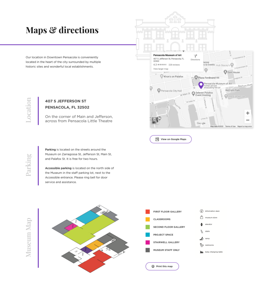
💟 Bonus points: add in some graphics, illustrations, photography, or videography for increased brand flair! 🪄