Sometimes you need to know your exact screen resolution to be able to troubleshoot sizing issues on the web.
Finding your screen resolution
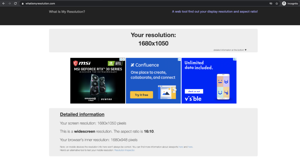
Introducing one of my favorite, and easiest to use, tools on the web:

I find this comes EXTREMELY in handy when a client is telling me that they’re seeing something weird or awry on their website, but I can’t see it myself. I can quickly shoot this link over to them and get their screen resolution, without getting too technical.
Using Google Dev Tools
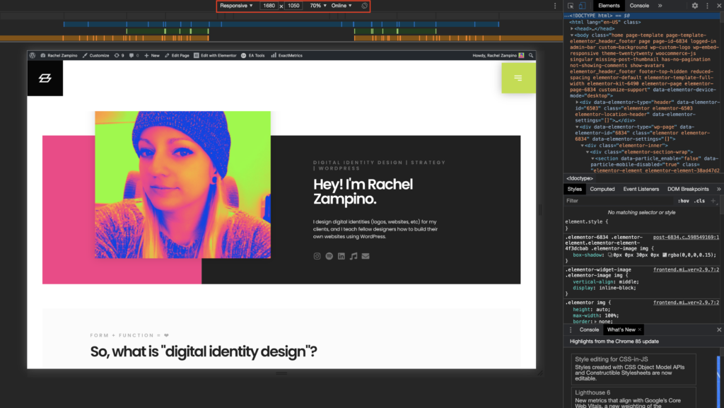
From there, I can plug their resolution into Google’s Dev Tools and see what they are seeing.
If you’re unfamiliar with Google’s Dev Tools – here’s a quick tutorial on how to access it:

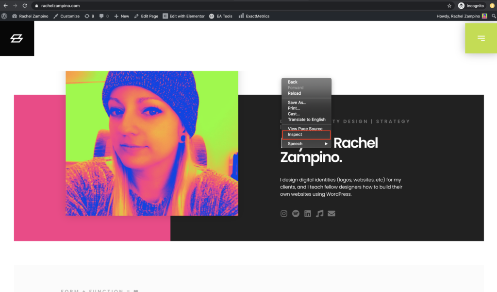
- Using Google Chrome as your browser, you can right click anywhere on the screen and select “Inspect” from the dropdown
- From there, a right sidebar will pop out – which you don’t really need to worry about right now
- The important part is at the top of the window – where you can select from multiple screen size options (i.e. phones, tablets, etc) – in this case, we will select “Responsive”
- This mode allows you to type in a custom screen resolution – so we will plug in your client’s dimensions that we found via whatismyresolution.com
- Viola! You will now be seeing the website as your client sees it on their screen!

Makes your life SO much easier, right?!
Best of luck!
💜 Rachel
- Updated on
Get biz & website tips in your inbox 💌
Sign up for the email list for free tutorials, cool tools, and DIY tips!
Jump to a section:
Save or share this post
Leave a comment

Rachel Zampino
Website Wizard
Hi! I’m Rachel Zampino, freelance WordPress developer and digital designer. Here to share all of my business and website tips with you.
If you enjoyed this post, consider buying me a coffee to show your support — or hire me to build you a website that you’ll be proud to show off!

